
Payton Plumbing, LLC
Client: Alex Payton, Owner
Deliverables: Logo, Brand Identity Guide, Vehicle Decals, Business Cards, Social Graphics Design
Payton Plumbing was a new plumbing company entering a competitive local market. They needed a complete visual identity that would communicate professionalism, trustworthiness, and approachability while helping them stand out from competitors. The brand also had to be versatile — working across vehicle wraps, print collateral, and digital channels.
Process & Approach
-
I began by analyzing the local plumbing market, identifying overused design elements and gaps where Payton Plumbing could stand out. Many competitors relied on dated typefaces and muted colors, which opened the door for a cleaner, bolder approach.
-
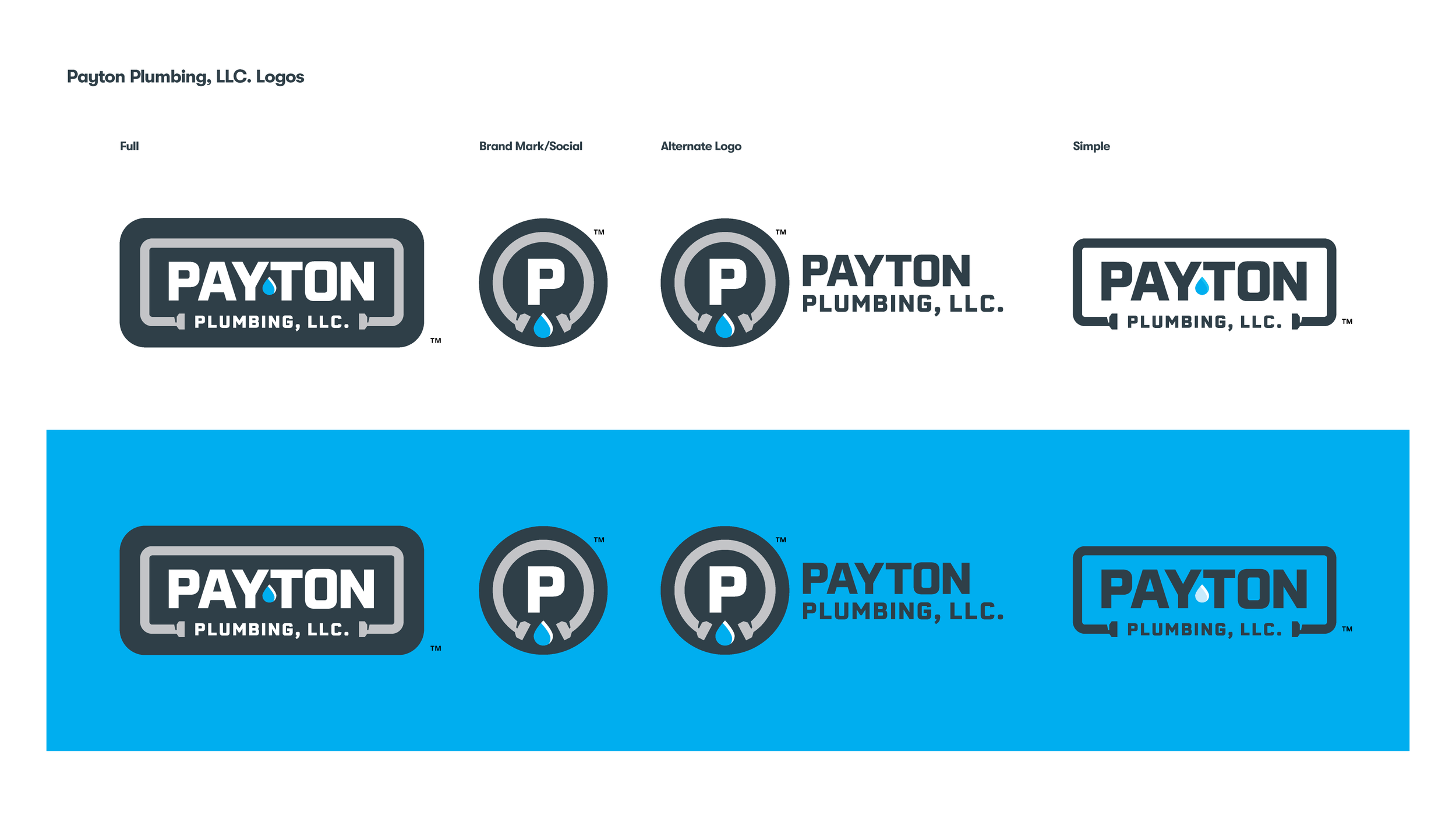
Initial sketches explored plumbing-related imagery like faucets, pipe shapes, and water drops. The chosen direction framed the company name within a clean pipe outline, incorporating a subtle water drop into the logotype for instant category recognition.
-
The final brand identity system included:
A full logo plus alternate marks for flexible application.
A color palette of bold blue and steel gray for contrast and legibility.
Typography choices that balanced modernity with dependability.
Applications spanning vehicle decals, business cards, branded stickers, and social graphics.
-
While Alex worked with a web developer on a very basic website, I equipped him with all the brand-ready assets, color specs, and logo files needed to ensure the site reflected the same polished, consistent identity across all touchpoints.


Results & Impact
Within the first six months of launch:
-
The distinct van graphics quickly became recognizable in the community, helping Payton Plumbing stand out from established competitors.
-
Alex reported a noticeable uptick in call volume, attributing many new customer leads to people spotting the branded vehicles on the road.
-
The brand presentation helped position Payton Plumbing as a trustworthy, established choice despite being new to the market.
-
From vehicles to business cards to the new website, every element reinforced the same message — professional, reliable, approachable.
Retrospective
Looking back, I see opportunities to take the brand further by adding other customer-facing assets such as thank-you postcards, door hangers, referral cards, and social media templates. If I approached a similar project again, I’d expand the scope earlier to include these kinds of branded touchpoints. Together, they would create a fuller suite of experiences that extend the company’s visibility, nurture loyalty, and amplify growth through personal connection and scalable communication.
Overall, the client was excited to launch with a professional, recognizable identity, and I was equally proud of how the system came together. The project not only gave Payton Plumbing a strong foundation for growth but also reinforced for me how meaningful it is to equip a new business with the tools to look established, trustworthy, and ready to thrive from day one.